Monitoring & Control Swimlane
Designing a workforce management platform for data center teams, including journey mapping, dashboard UX, and tools for labor force managers and contributors.
Problem hypothesis
Target Audience
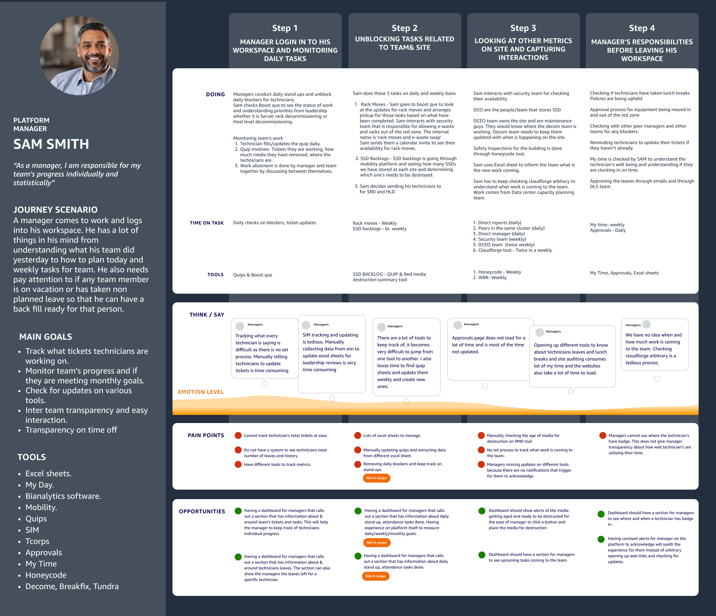
Labor Force Managers.
Currently, Labor Force Managers lack a mechanism on the Boost platform to view and manage relevant work for their teams. They rely on manually scanning work requests and basic filters without a way to aggregate or prioritize tasks. They need a clear view of different work buckets — such as ongoing, upcoming, prioritized, assigned, unassigned tasks, and team attendance — to plan and manage their teams effectively
Customer Journey Map
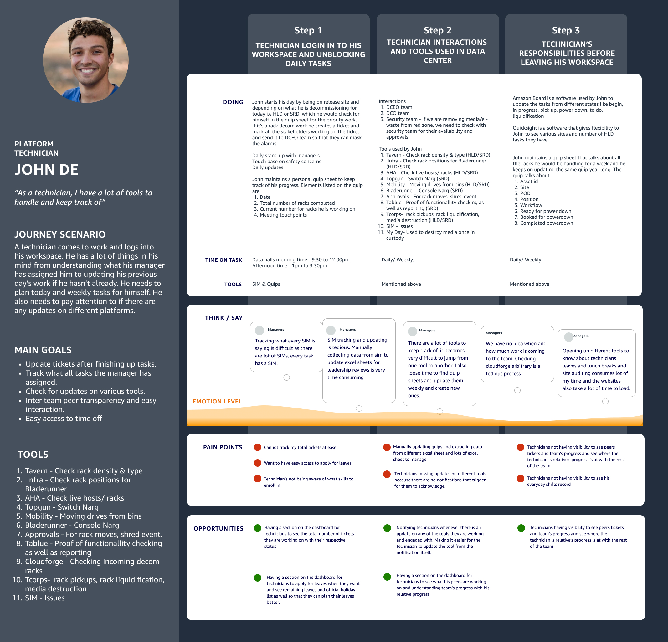
Labor Force Contributors.
Today, Labor Force Contributors struggle to work as a team due to an unclear, opaque system on the Boost platform. They lack visibility into data center issues and assigned tasks, causing delays in action. Contributors want clarity on their work, professional goals, and skill development paths to improve team performance
Homepage design screen for LFM & LFC
Sam's Interface - Labor Force Manager
Greeting Title
with briefing of managers role
Presenting an overall picture of the stats for the user to keep track of its tasks
The stats are divided into 3 parts: Incoming deliveries - Deliveries of the new racks to the site, Late deliveries - Late deliveries to the site, Asset handed off - Rack handed off for liquidification
This section talks about site deliveries of the site Sam is handling
Clicking on view all will show data of all sites decommission work is handled.
This section talks about upcoming work requests from the data center planning committee
This will help Sam keeping track of all the work that is coming in and plan better directions for the team.
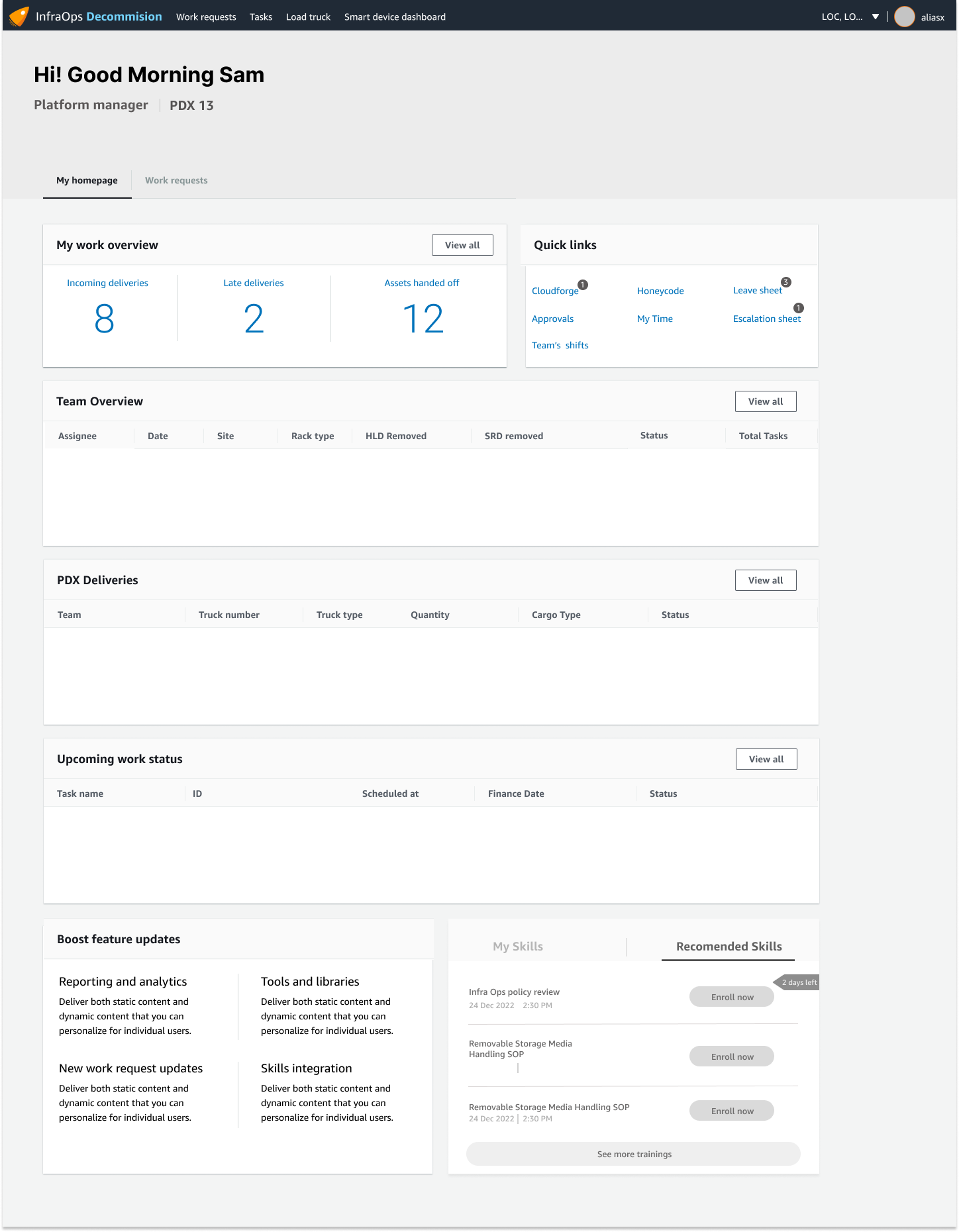
Quick link section is very helpful for the managers as they have a lot of tools spread out in their system
This will help them finding one stop for all. This will also show updates which otherwise is not possible.
I have introduced new links like Escalation sheet, leave sheet, which are the current problems for managers.
Team overview will help manager in understanding team's over all progress and individual progress as well
This will help manager setting right expectations from the team and helping technicians perform better by showing them their history of work and pointing at right growth areas
Showcasing training helps the managers go and review the training they have done and the system can also show the awards user has won accordingly
The recommended training section will also emphasize on skills the manager should enroll for. It's a good to have section which prompts daily/weekly skill training for the user.
John's Interface - Labor Force Contributors
A greet message for the user
Showcasing his/her's designation and the respective site
Presenting an overall picture of the stats for the user to keep track of its tasks
The stats are divided into 3 parts: total tasks, open work request, security alerts. This section also enables the user to see his performance review summary.
total tasks
open work requests
security alerts
Showcasing training helps the user go and review the trainings they have done and the system can also show the awards user has won accordingly
Showcasing team goals is a good section for a technician to see as it helps them align with team's progress and capture metrics on team level. This will also help user ace up in their individual goals.
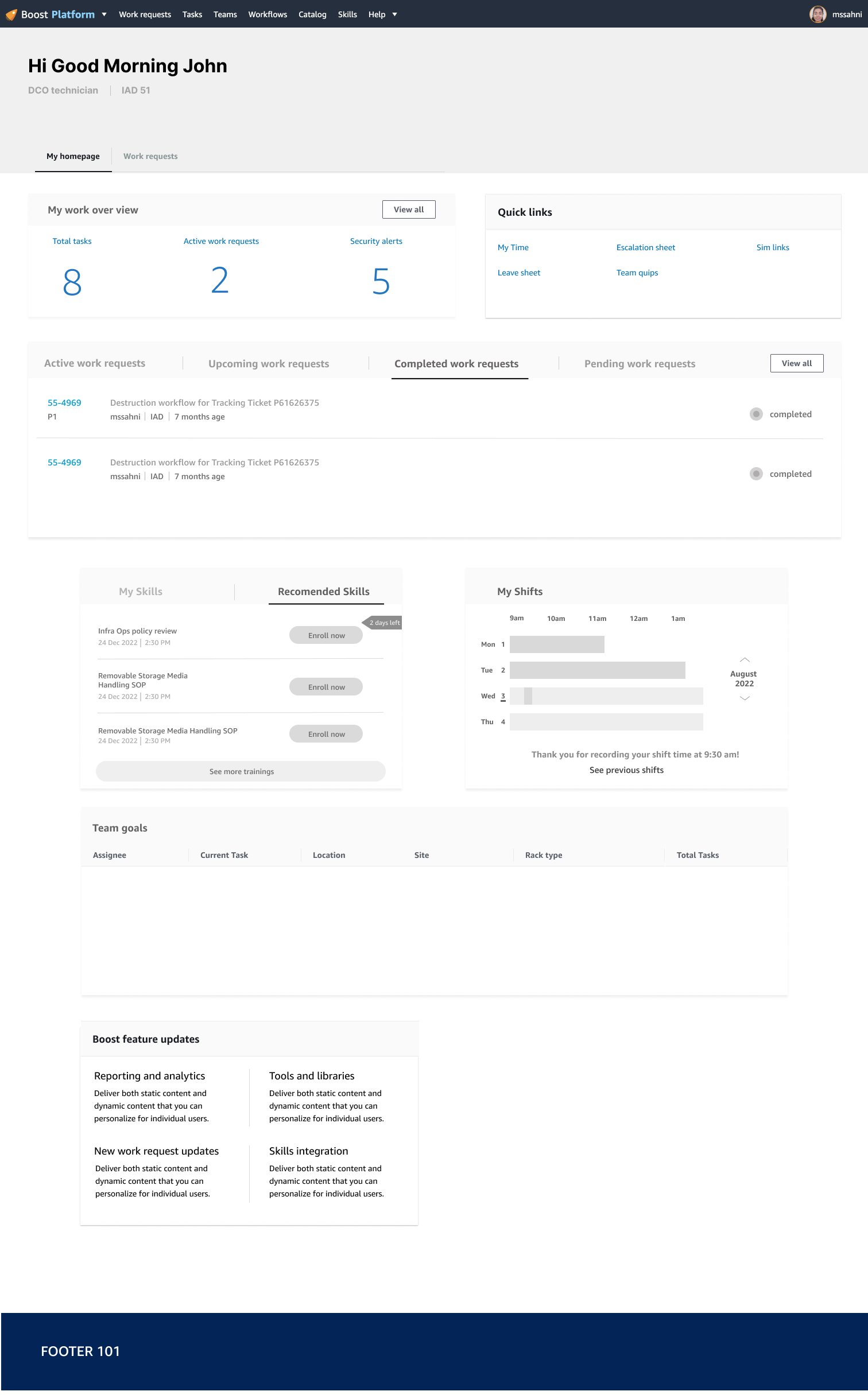
Quick links are beneficial for users to have one stop for all the tools and process used in the team.
This section enables users to speculate 3 things
Active WR - making them in sync with the active work task
Upcoming WR - making them prepared for the ahead timelines
Completed WR - making them keep a track of his progress so far