Thank You Page Revamp
User experience research and design improvements for Amazon Pay payment platform, focusing on user pain points and service optimization through comprehensive user scenario analysis.
User scenario on current system
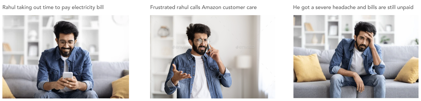
Rahul, thrilled with his first paycheck, eagerly took on the responsibility of paying household bills to ease his dad's burden. He opted to use Amazon Pay after seeing its seamless payment ads & chooses to be it's first customer. However, his experience with the service left him frustrated and anxious.
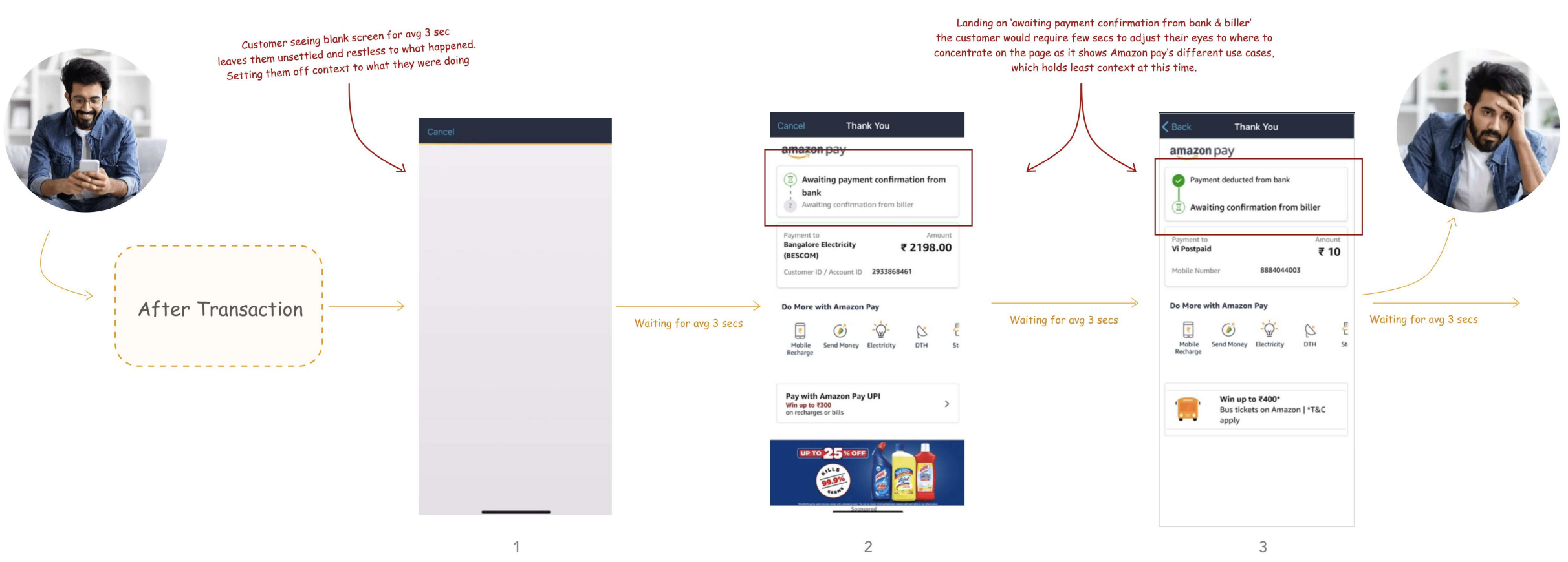
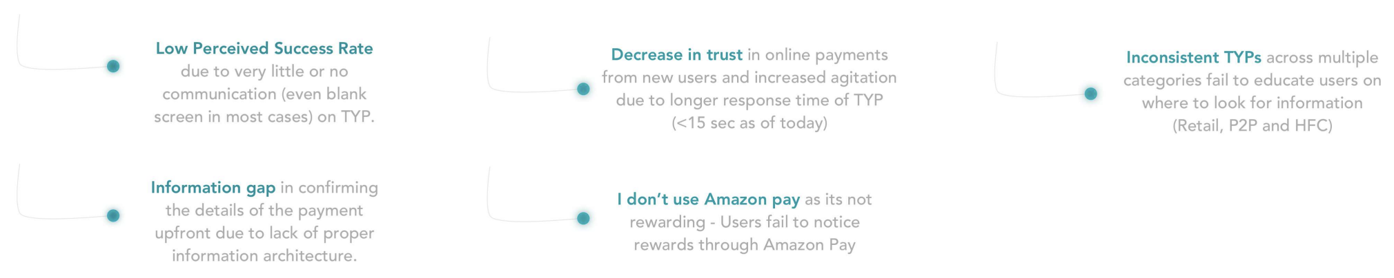
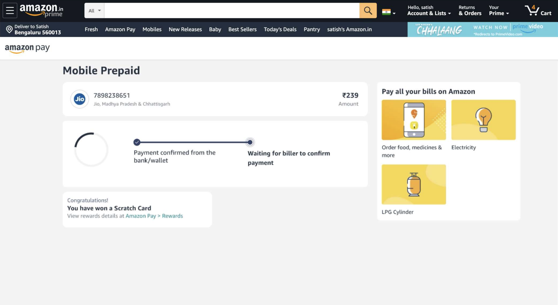
Current system has a lot of UX glitches and information gap which starts from the point as users tap Pay now & following are the steps/screens they have to go through before landing on the TYP
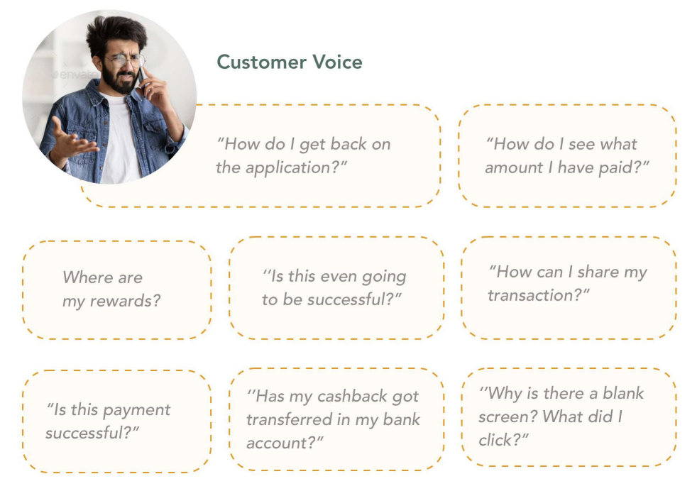
Research insights
High Level Design Critic
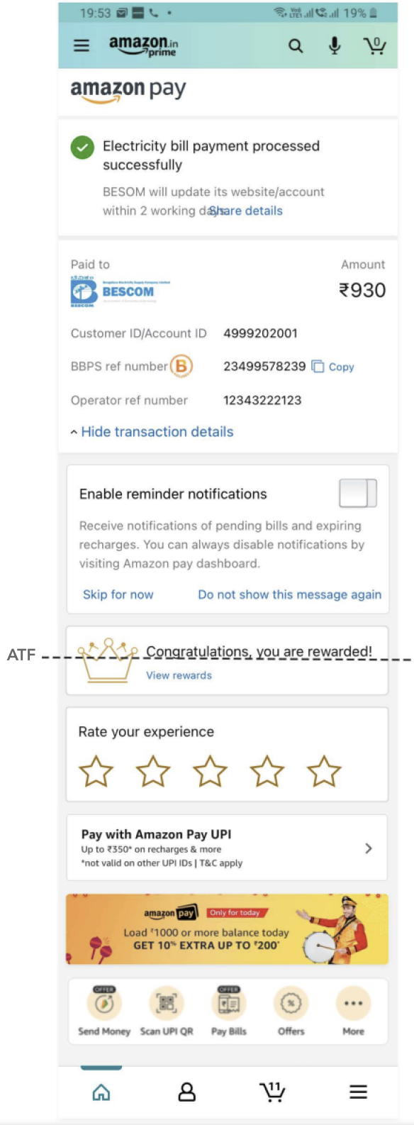
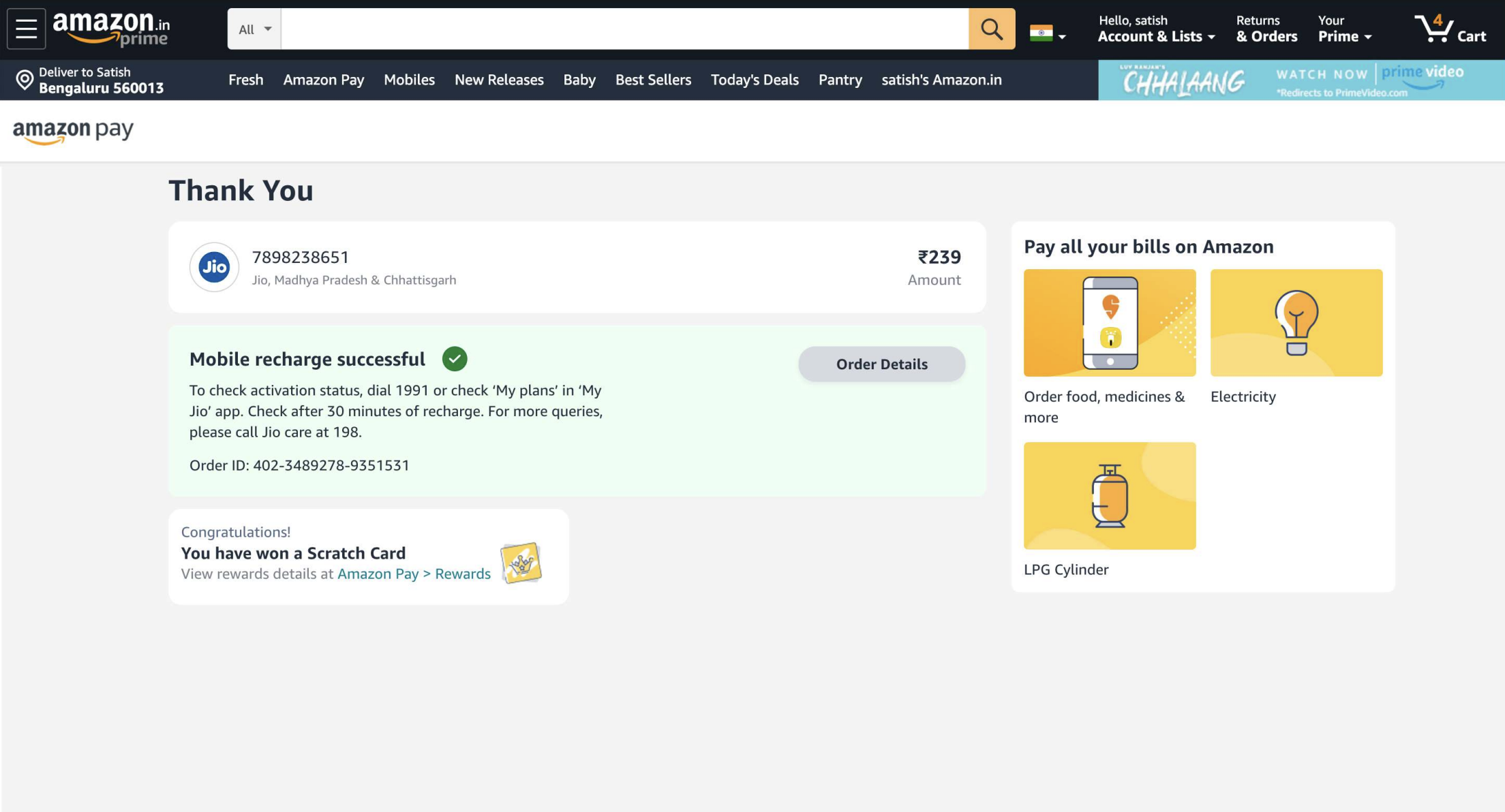
Customers often don't realize they've reached the final step of the transaction & landed on the Thank You page, as there's no clear visual break or distinction from the previous pages.
The success card's visual treatment closely resembles the cards beneath it, diminishing the sense of achievement & excitement that should come with a successful transaction.
The abundance of elements on the page can slow down customers as they try to read & comprehend every section
Positioning the rewards card at the edge of the ATF may cause customers to overlook it. Given its role in building trust and encouraging repeat engagement with Amazon Pay, this section holds higher priority than those placed above it.
Different categories use inconsistent Thank You page designs and language, making it difficult for customers to develop a familiar mental model of this key transaction moment.
Problem hypothesis
Our understanding of the customer frustrations is based on multiple studies that have been conducted in US and in India to understand users behaviour around thank you pages. While most of the frustrations are based our understanding of the problem, we plan to test this experience with users against the below problems -
Design Goal
Make Amazon Pay the most trusted, convenient and rewarding way to pay
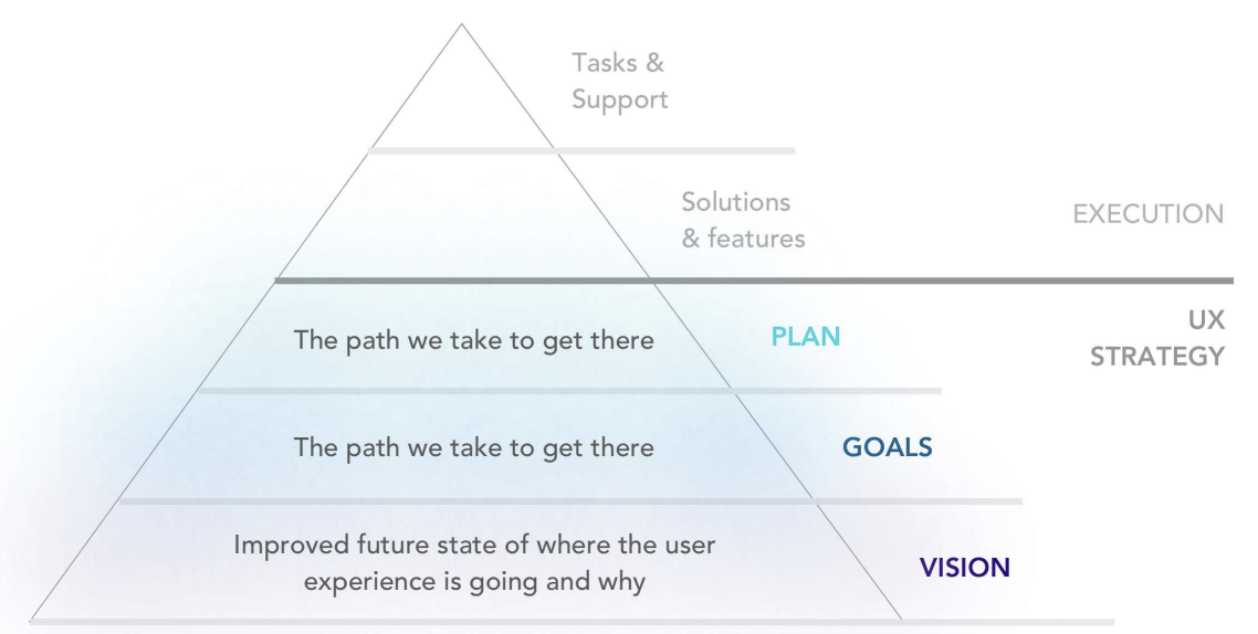
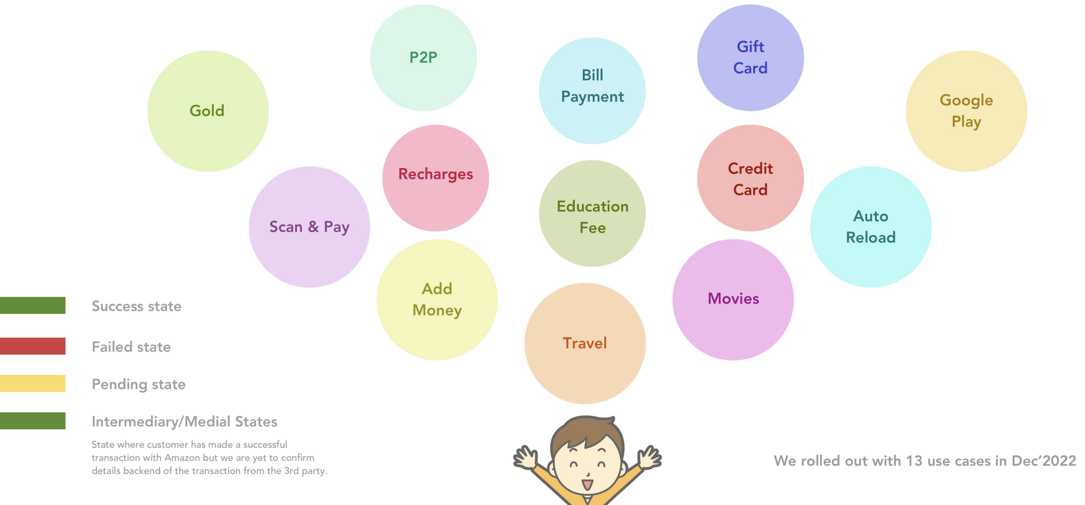
Use cases & states
Process exploration end to end
First time use case design journey
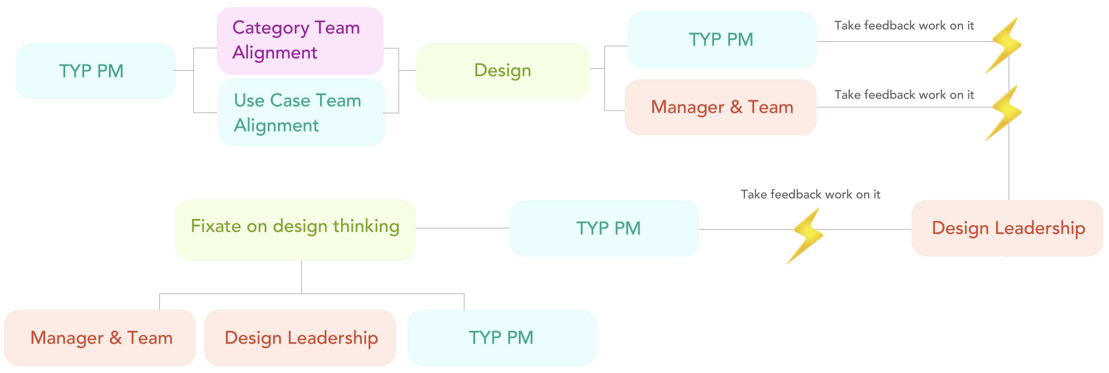
Writing MOM mails throughout!
Scalable design thinking to 13 use cases journey
Design screens
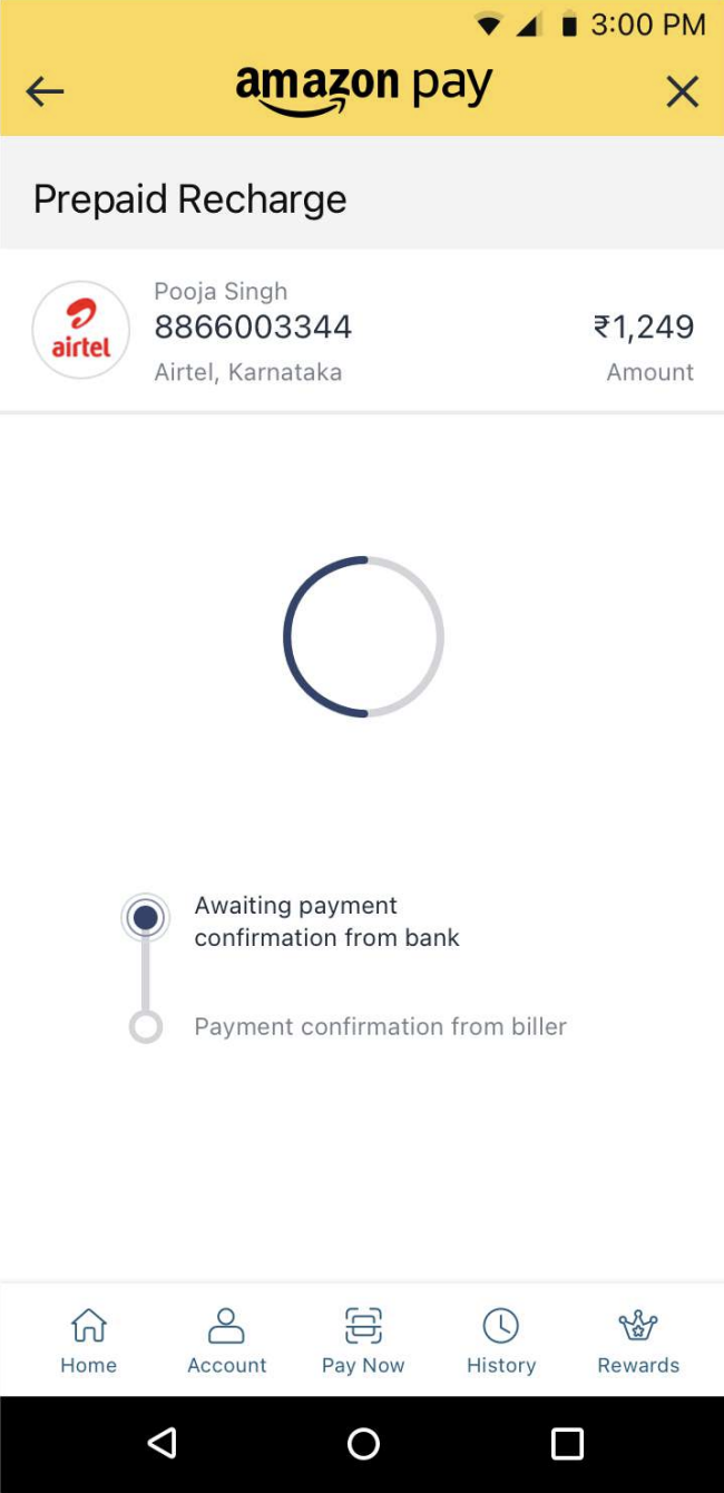
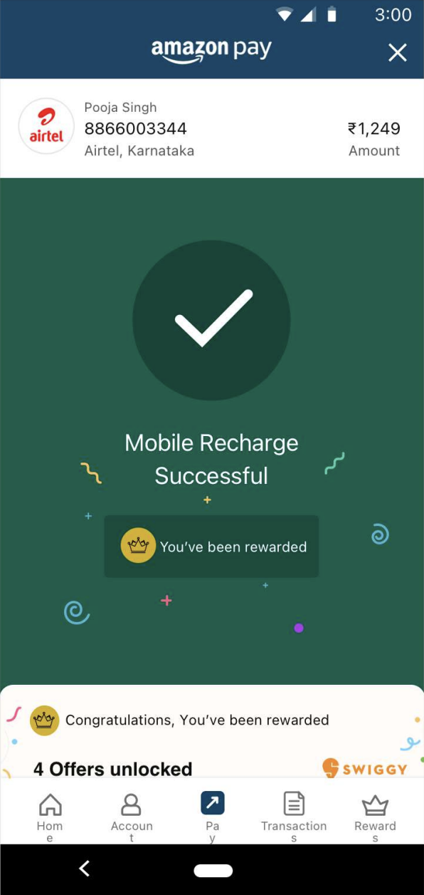
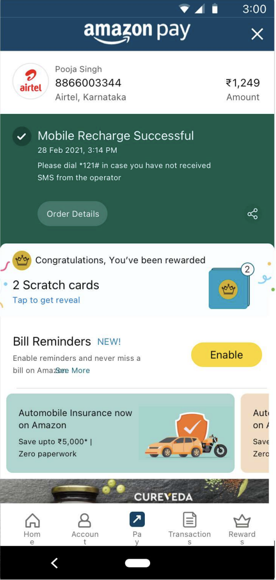
Processing screen 1
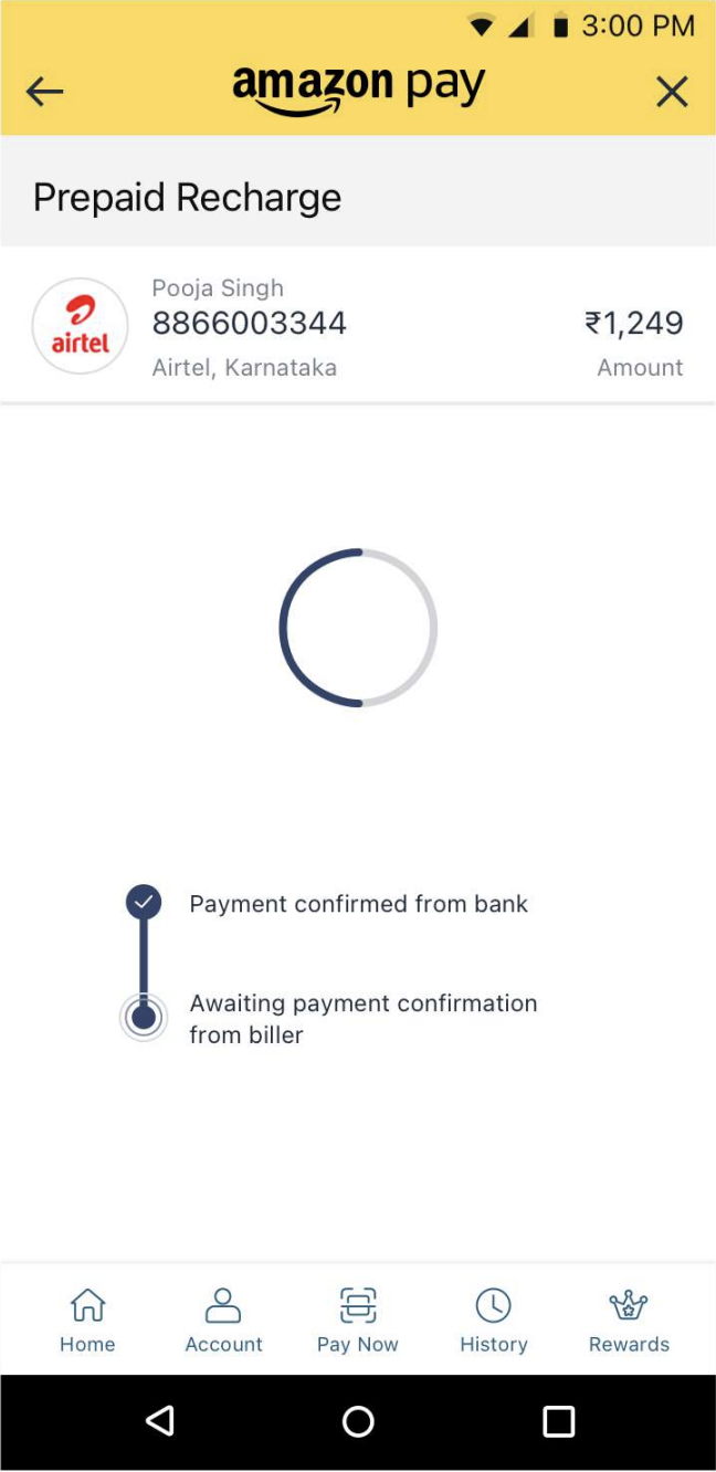
Processing screen 2
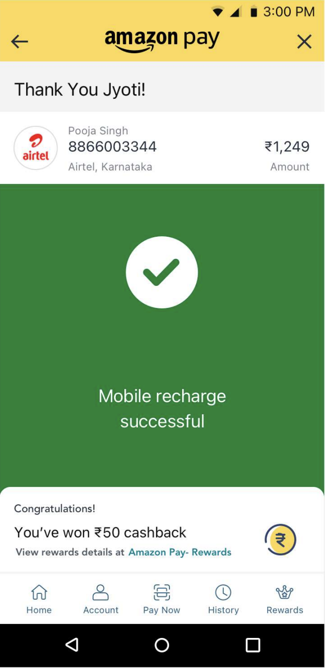
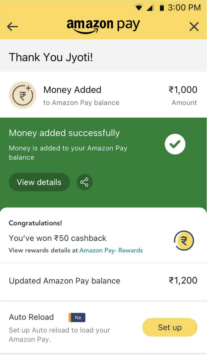
Expanded TYP
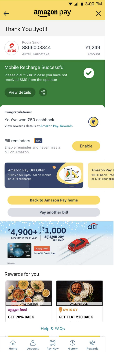
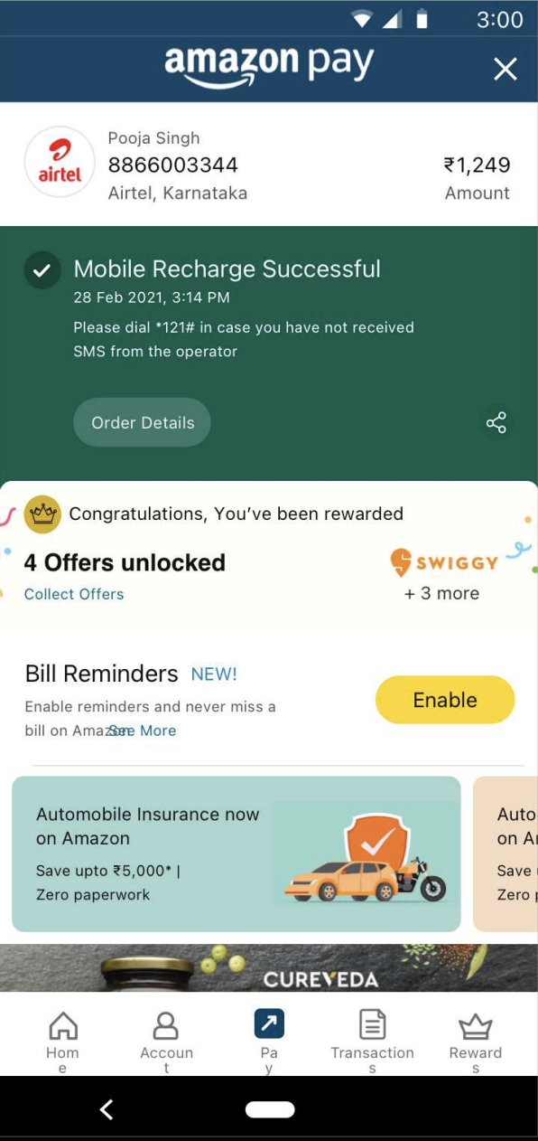
Stable TYP
Design direction reasoning
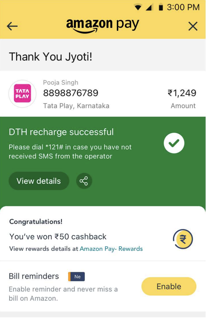
- The expanded TYP design captures central object on top which is anchoring the page to give out context to the customer.
- The confetti burst is a visual representation for reward on expanded TYP to grab customer's attention.
- Moving to stable TYP through the drawer experience (auto collapse) the central object remains constant
- The design captures central object on the top which will anchor the page and set context to the customer.
- Followed by the state of the transaction which is tied up with order details, as they are co-dependant and further sets clarity to customer in the 'state chicklet'
- Order detail information is 1 click away as its a good to have information not must seen information
- Your reward is anchoring the drawer experience as the idea is to give visibility to rewards for customer satisfaction and joy.
- Followed by the next best action on the screen, followed by ads and marketing banner & recommendations.
Design screens
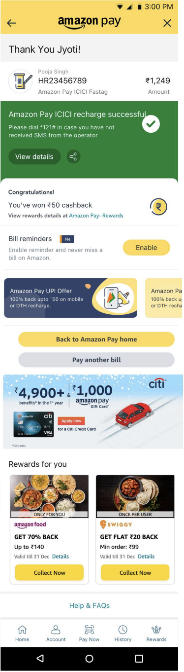
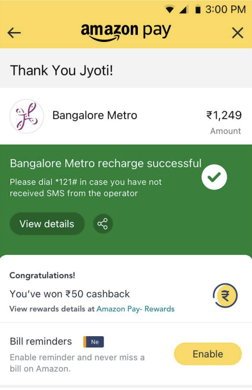
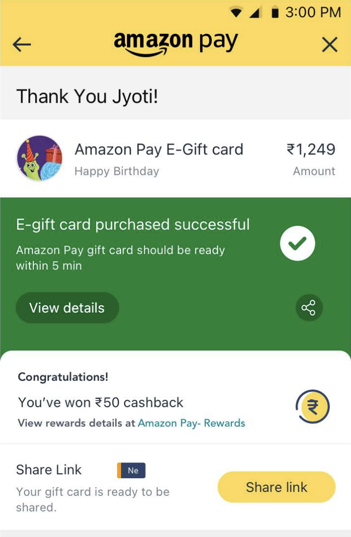
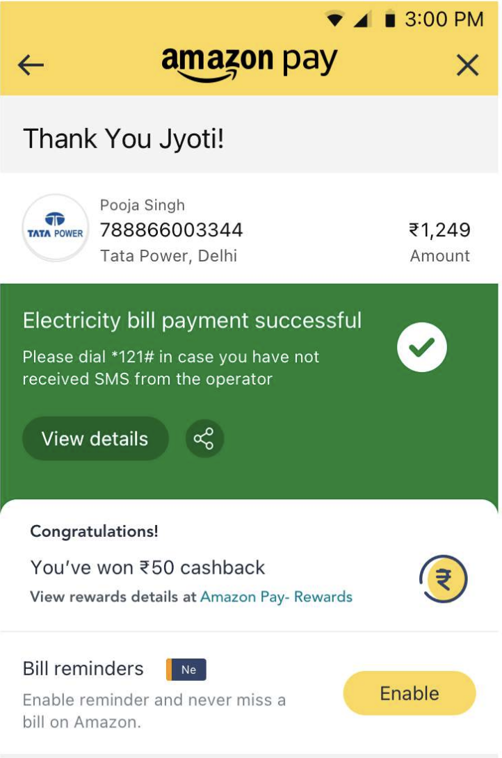
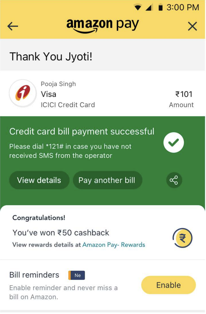
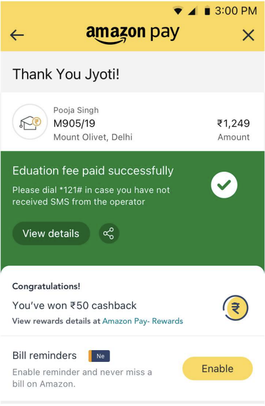
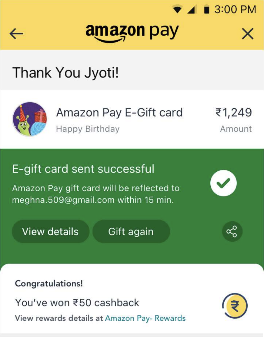
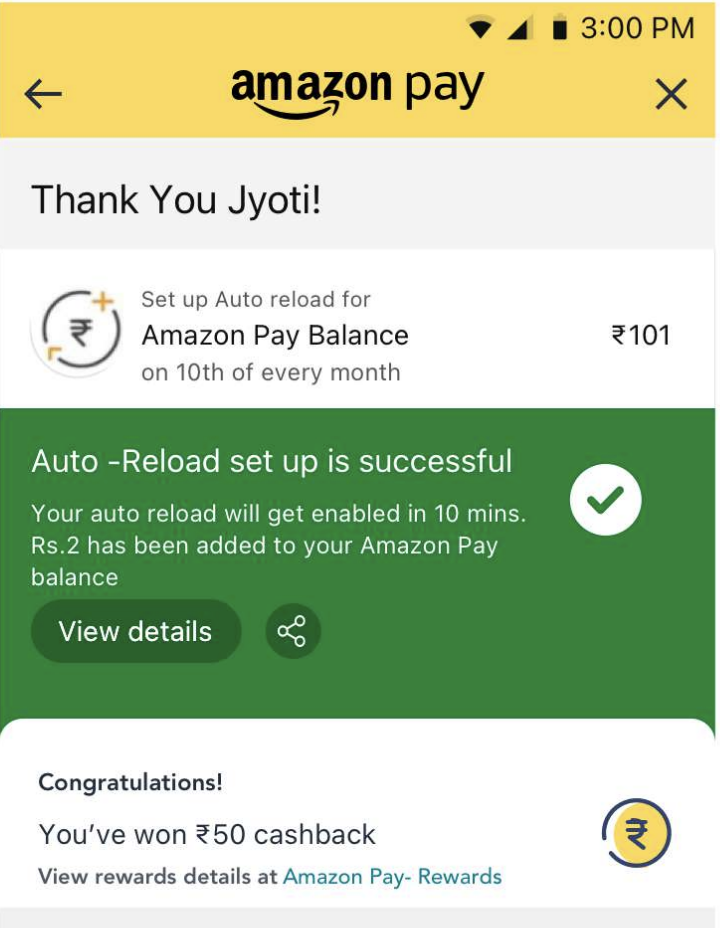
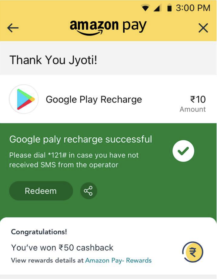
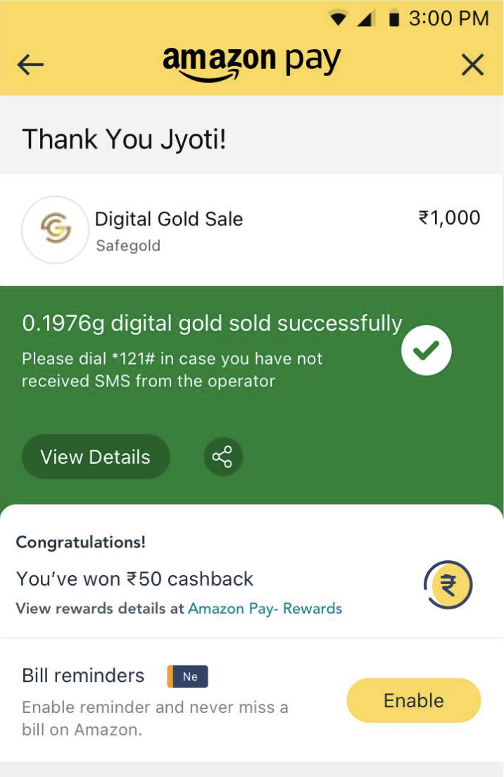
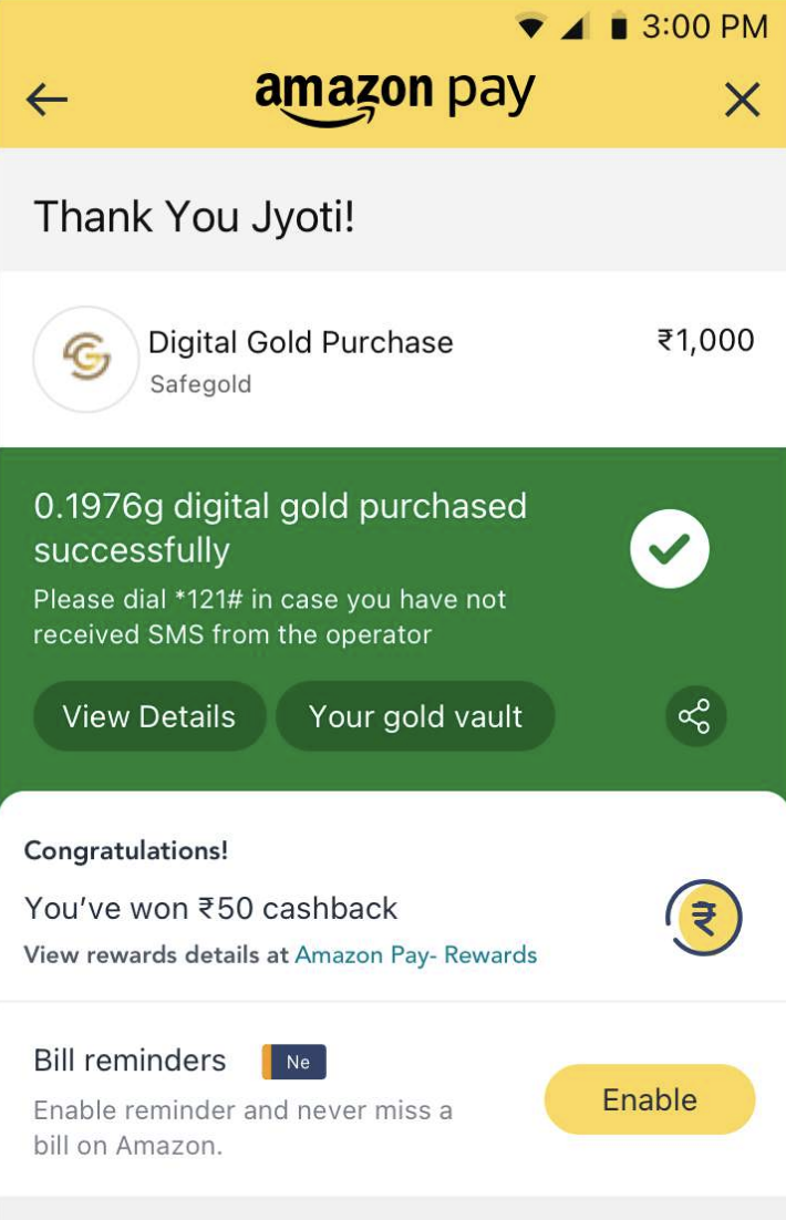
Thank You page designs across multiple Amazon Pay use cases
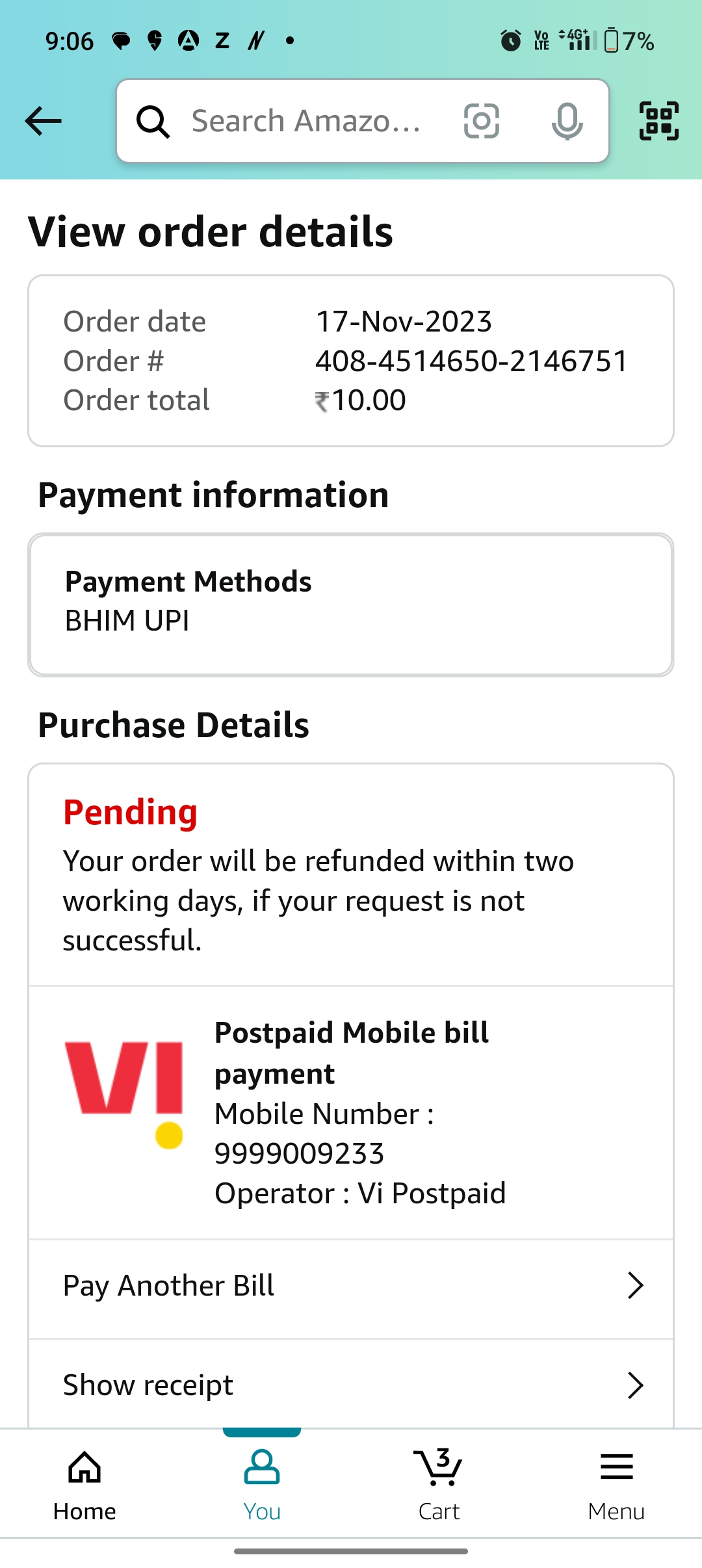
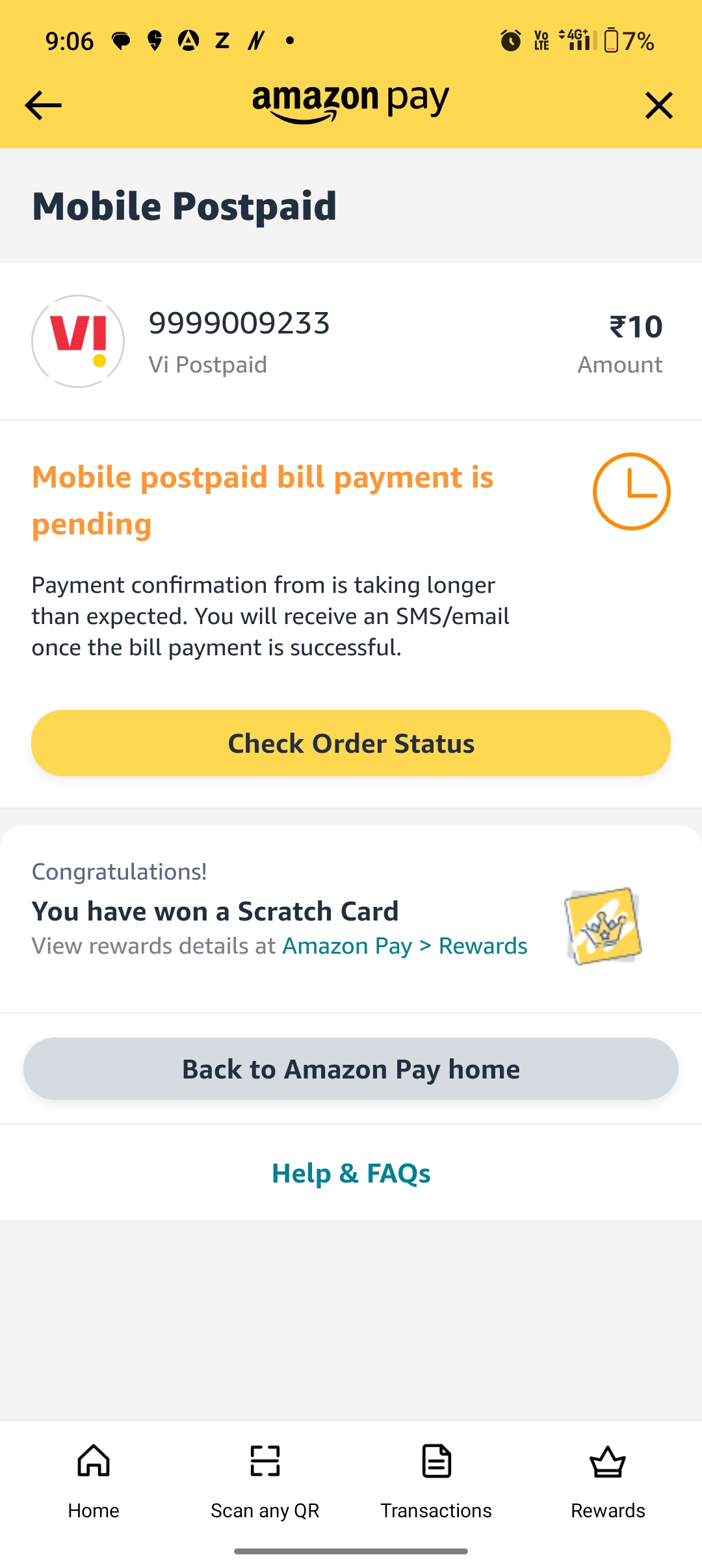
Pending State
Failed State
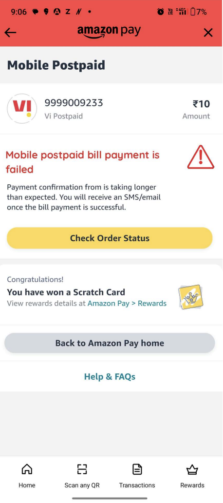
Edge case TYP design for the user to be aware of why their transaction went into failed/pending state and what are the next best actions they can take to come out of this state.
This page also does not push the user out of Amazon, but enables the user to surf inside Amazon and look at other use cases. This way
Cross product impact - rewards experience (LIVE')
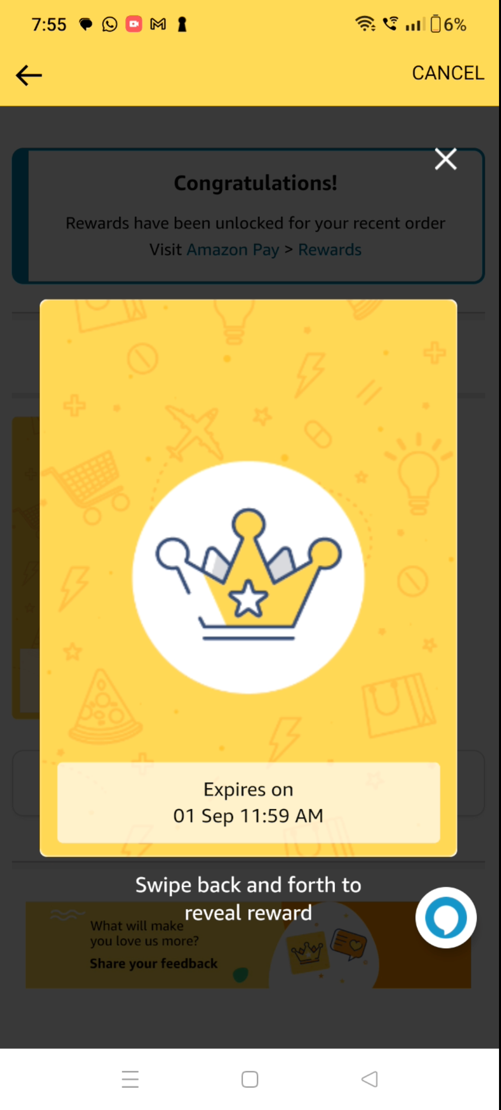
Rewards Presence on Thank You page
Rewards Experience Step 1
Rewards Experience Step 2
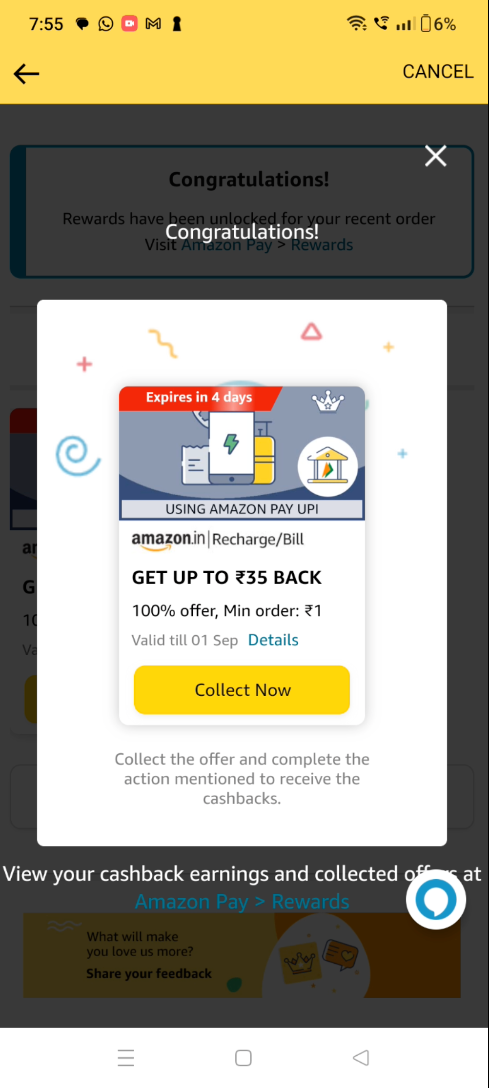
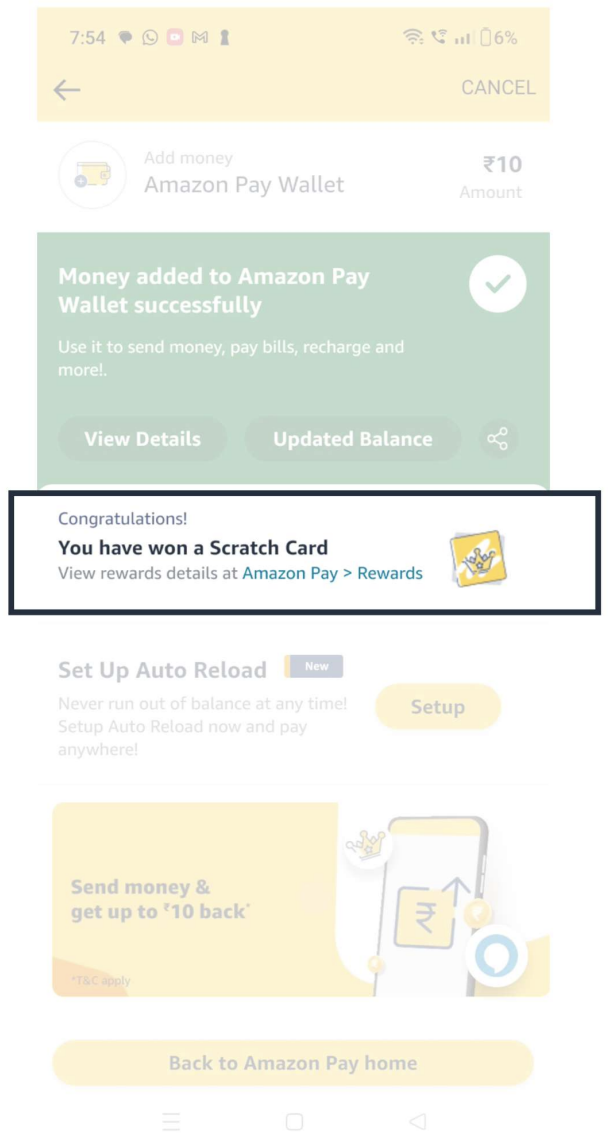
Observed gaps in rewards experience while designing rewards component on TYP.
Taking ownership to re structure rewards experience
Addressing, convincing leadership & rewards team about the gaps by making case studies about the current experience & it's fallouts.
Design new experience by listing pros and whys of new design
Going Above & Beyond to re-design the experience keeping customer as center of focus.
Interactive & scalable design thinking
Wireframes
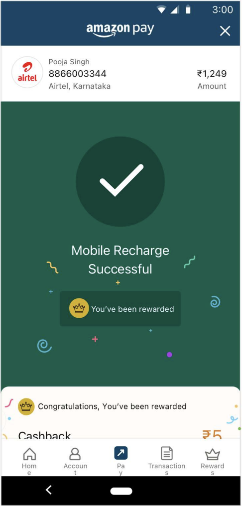
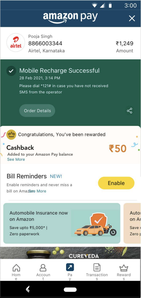
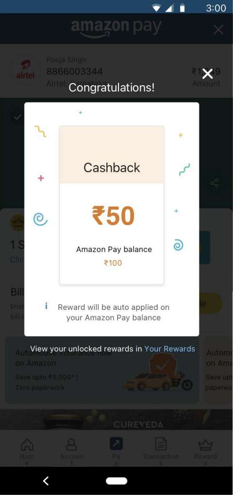
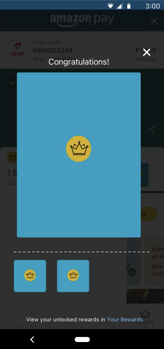
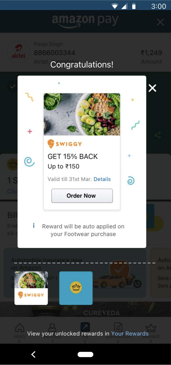
Cashback Rewards
Why this ideation would work?
1) Rewards getting highlighted by both channels - highest priority element on drawer.
2) Congratulation line... tying the whole component of rewards.
3) Reward icon will create a mental modal in customer's head.
4) Cashback all elements crystal clear
5) Offers visual showcase over text
6) Multiple rewards layout flexible enough to stretch to heavier use cases.
7) The layout is also easy to navigate and switch between rewards. You are able to see 4 rewards at 1 time
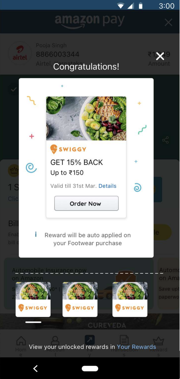
Offer Rewards
Base Rules for the design
1) All cards are clickable and will lead to the pop up experience (Cashback/offers/Scratchcard)
2) All 3 channels of rewards have been drawn into cards.
3) No rewards, no confetti
4) Only scratch cards are scratchable cards, Cashback and offers are view cards
Scratch Card
Desktop designs
Processing screen 1
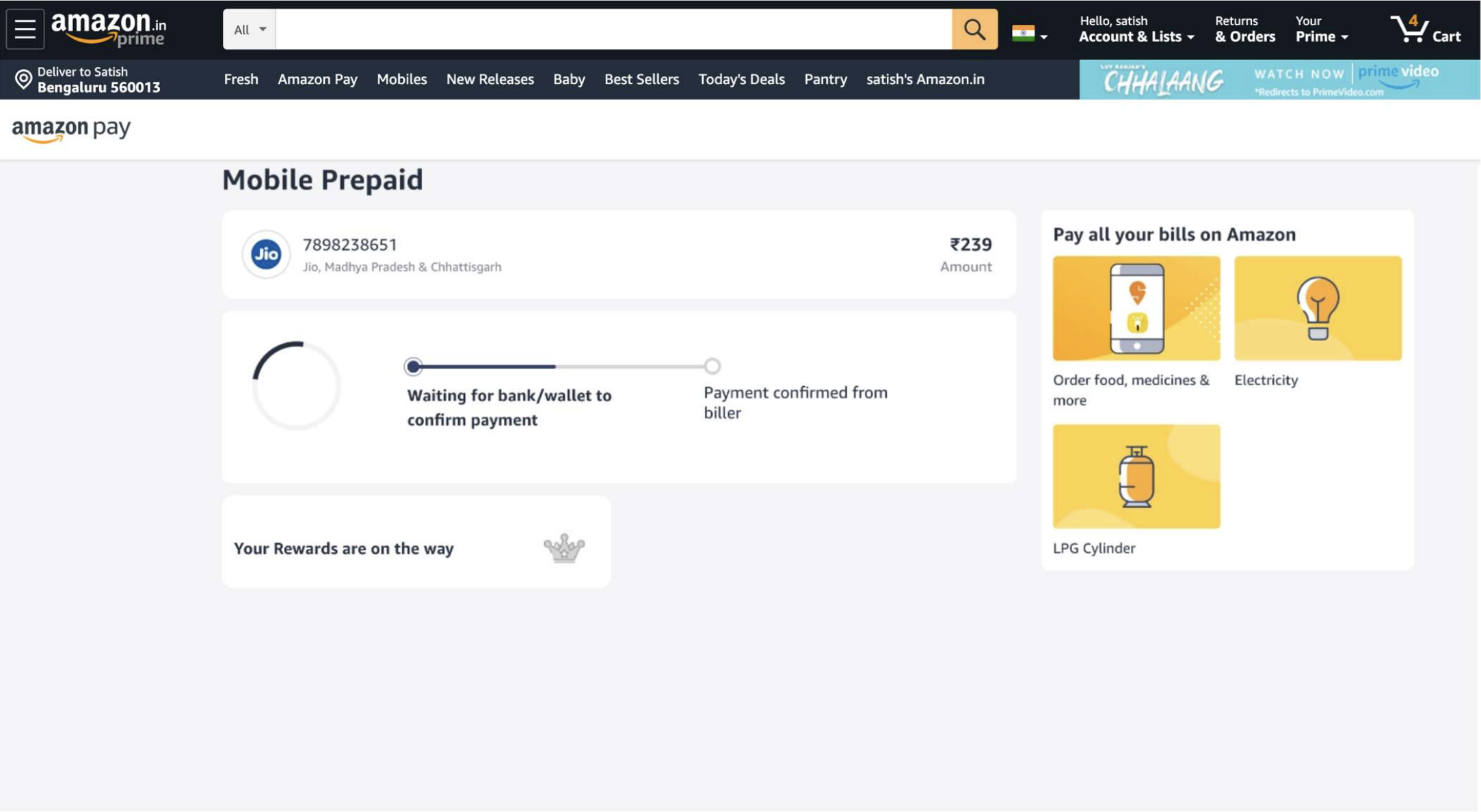
Processing screen 2
The design captures central object on the top which will anchor the page and set context to the customer.
Followed by the state of the transaction which is tied up with order details, as they are co-dependant and further sets clarity to customer in the 'state chicklet'
Order detail information is 1 click away as its a good to have information not must seen information, a modal experience would help the customer to concentrate on the element they are clicking to read through.
The design captures central object on the top which will anchor the page and set context to the customer. The confetti burst happens on rewards element to highlight the reward piece
The marketing slot is a quad card that gives us the opportunity to project 3 more use cases and interest the customer back onto the website.
UX Writing

- Took ownership to be ux writer
- Completed Ux writing course from Amazon
- Earned trust by presenting learnings from the ux writing to leadership
- Presented solutions to the design
- Aligned leadership and respective use case teams on ux writing by educating and listing whys.
- Scalable design
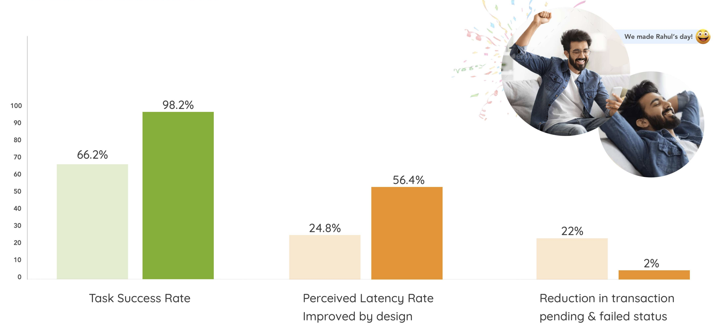
UX and Tech metrics tracked